
- Financial Performance – A Complete Tutorial
- How Six Sigma Principles Can Progress Your Productivity – Tutorial
- Google Analytics Pro Tutorial | Fast Track your Career
- Activity-Based Costing Tutorial | Know about Definition, Process, & Example
- Create a workbook in Excel Tutorial | Learn in 1 Day
- Excel ROUNDUP Formula Tutorial | Learn with Functions & Examples
- Business Analytics with Excel Tutorial | Learn In 1 Day
- SAP Tutorial – Free Guide Tutorial & REAL-TIME Examples
- IBM SPSS Statistics Tutorial: Getting Started with SPSS
- SAP Security Tutorial | Basics & Definition for Beginners
- SAP Simple Finance Tutorial | Ultimate Guide to Learn [Updated]
- SAP FIORI Tutorial | Learn in 1 Day FREE
- Introduction to Business Analytics with R Tutorial | Ultimate Guide to Learn
- Tableau Desktop Tutorial | Step by Step resource guide to learn Tableau
- Implementing SAP BW on SAP HANA | A Complete Guide
- SAP HANA Administration | Free Guide Tutorial & REAL-TIME Examples
- Tableau API Tutorial | Get Started with Tools, REST Basics
- SAP FICO ( Financial Accounting and Controlling ) Tutorial | Complete Guide
- Alteryx Tutorial | Step by Step Guide for Beginners
- Getting started with Amazon Athena Tutorial – Serverless Interactive | The Ultimate Guide
- Introduction to Looker Tutorial – A Complete Guide for Beginners
- Sitecore Tutorials | For Beginners Learn in 1 Day FREE |Ultimate Guide to Learn [UPDATED]
- Adobe Analytics Tutorial – The Ultimate Student Guide
- Splunk For Beginners – Learn Everything About Splunk with Free Online Tutorial
- An Overview of SAP HANA Tutorial: Learn in 1 Day FREE
- Statistical Package for the Social Sciences – SPSS Tutorial: The Ultimate Guide
- Splunk For Beginners – Learn Everything About Splunk with Free Online Tutorial
- Pentaho Tutorial – Best Resources To Learn in 1 Day | CHECK OUT
- Statistical Package for the Social Sciences – SPSS Tutorial: The Ultimate Guide
- An Overview of SAP HANA Tutorial: Learn in 1 Day FREE
- Spotfire Tutorial for Beginners | Quickstart – MUST- READ
- JasperReports Tutorial: Ultimate Guide to Learn [BEST & NEW]
- Charts and Tables – Qlikview Tutorial – Complete Guide
- TIBCO Business Works | Tutorial for Beginners – Learn From Home
- Cognos TM1 Tutorial : Learn Cognos from Experts
- Kibana
- Power BI Desktop Tutorial
- Tableau Tutorial
- SSAS Tutorial
- Creating Tableau Dashboards
- MDX Tutorial
- Tableau Cheat Sheet
- Analytics Tutorial
- Lean Maturity Matrix Tutorial
- MS Excel Tutorial
- Business Analysis Certification Levels & Their Requirements Tutorial
- Solution Assessment and Validation Tutorial
- Lean Six Sigma Tutorial
- Enterprise Analysis Tutorial
- Create Charts and Objects in Excel 2013 Tutorial
- Msbi Tutorial
- MicroStrategy Tutorial
- Advanced SAS Tutorial
- OBIEE Tutorial
- Tableau Server Tutorial
- OBIA Tutorial
- Business Analyst Tutorial
- Cognos Tutorial
- Qlik Sense Tutorial
- SAP-Bussiness Objects Tutorial
- SAS Tutorial
- PowerApps Tutorial

Tableau Desktop Tutorial | Step by Step resource guide to learn Tableau
Last updated on 10th Aug 2022, Blog, Business Analytics, Tutorials
Introduction to Tableau
With data serving as the foundation of modern organizations, it is unavoidable for them to make the most of data sources. Data, on the other hand, is made available in its complex raw form. As a result, comprehending it with the naked human eye becomes difficult. This is where Tableau can help. Based on data inputs, this powerful Tableau data visualization tool generates intuitive reports.
What is Tableau?
According to Gartner, Tableau is one of the best business intelligence and analytics tools. Tableau’s success story is truly inspiring. Organizations use it extensively to make sense of data in a visually insightful format. Tableau can work with any type of data, including structured, unstructured, and semi-structured data. Tableau can also communicate with a variety of other tools and platforms, including Hadoop, R Programming, and others. Tableau does not require any technical knowledge to learn.
Why use Tableau?
This is the most important topic covered in any Tableau Tutorial. Tableau has the following features that set it apart from other Business Intelligence tools:
Visualization: For accurate visualization, Tableau connects to multiple data sources and supports larger datasets. It employs a drill-down method to reveal the relationship between the independent variables. Furthermore, the user can easily switch between different visualizations.
Performance: Tableau, in comparison to other Data Visualization tools, allows the user to show the relationship between different data variables using various shapes, figures, labels, colors, and so on.Tableau can connect to more data sources and handle larger datasets without affecting the data engine’s performance. Furthermore, augmented analytics enables users with varying skill sets to perform data cleaning and visualization.
Depth of Investigation: Tableau has numerous methods for determining the answer to the user’s questions. Tableau has the best data discovery and predictive analytics features, from basic trends to advanced ‘what if’ queries.
Community: Tableau has an expanding global community of experienced data scientists and business analysts. Unlike other BI tools, Tableau makes it simple to find solutions to problems. You can also learn about Tableau by browsing various open-source projects on GitHub.
Automation Capability: To save time and effort in Tableau, you can create and apply processing. Calculations based on various visualizations. For example, you can add a formula and apply it to all the rows in that data source to create a field. It’s a quick and easy way to create visualizations for recurring processes.
Connectors for Data Sources: Tableau supports the majority of data sources, making it easier to connect, clean, and identify hidden patterns in raw data. It can access large datasets from both on-premise and on-cloud sources without putting the system under strain. It supports both live connections and in-memory data extraction.
Tableau Applications: Tableau is such a powerful tool that it can be used in any industry because it can work with any type of data. So, in this Tableau for Beginners blog, we will list some of the real-world applications of Tableau.
- Create quick visualizations and insights from disparate data sources.
- You can improve query performance by leveraging the power of your databases.
- Work with statistical analysis tools such as trending and forecasting.
- Use extreme data discovery to uncover previously unknown insights.
- Connect to computer programming languages easily for powerful table calculations.
- Tableau dashboards allow you to interact with data in the most natural and interactive way possible.
What are the benefits of learning Tableau?
Tableau is one of the most popular business intelligence tools available today. As a result of the widespread use of this top data visualization tool, there is a scarcity of professionals who can use it. As a result, Tableau professionals earn some of the highest salaries in the IT industry. This is one of the most compelling reasons to learn Tableau. Aside from that, you should learn Tableau online for the reasons listed below:
- Data visualization and predictive analytics are now standard in every industry. Tableau can integrate with any data warehousing and ETL tool, making it extremely versatile.
- Tableau is constantly evolving, making a career in Tableau extremely promising.
- Tableau has a large and growing community, making it simple to learn and excel with Tableau.
- Tableau does not require any specialized skills or programming languages to learn.
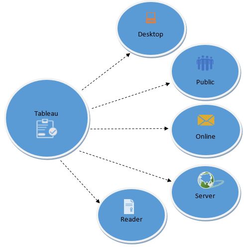
- Tableau Product Family
- There are various Tableau products that work together to help the user seamlessly transfer data, create data visualizations, and generate reports. Tableau products or components are listed below:
Desktop Tableau: Tableau Desktop enables users to connect data from various sources and create dashboards, stories, and workbooks. You can share all of the insights with other users and publish the workbooks on the Tableau website using the Tableau Desktop and website.Tableau Desktop allows users to run direct queries on datasets without writing code. Simply enter the columns you want to include and the visualizations such as a chart, table, graph, or map. Furthermore, Tableau Desktop combines multiple views from various sources.
Tableau Server: Tableau Server is used to publish reports and workbooks that have been created in Tableau Desktop. It allows the user to access workbooks and reports from any location on the planet.With Tableau Server, you can get the most up-to-date content and live access to workbooks and reports created by other users. To ensure security, the administrator of Tableau Server can restrict access to specific projects, views, workbooks, and data sources.
Tableau Reader: It’s a free application that you can install on your desktop to view data visualizations created by Tableau Desktop users. Tableau Reader allows you to view, interact with, add various types of filters, and drill down into data without changing the original datasets or visualizations.
Tableau Public: This Tableau Public tutorial also shows how it is free software that can be used by anyone to analyze data and create visualizations. You can create workbooks or reports and save them in Tableau Server, but anyone can view those visualizations because it is public.
Tableau Online: Tableau Online is a cloud platform that allows users to easily publish and share dashboards with others. It enables you and your colleagues to collaborate on a project while extracting valuable information that can be converted into visually interactive workbooks. The website, Tableau Desktop, and Tableau mobile applications all have access to these visuals.
Tableau: This is yet another topic covered in any of the Tableau tutorials. To create data visualizations with Tableau Desktop, you must first complete three basic steps:
- Connect the data
- Experiment with the interface.
- Design data visualizations
Connect the data:
You can connect your data from various sources on the left side of Tableau Desktop. Both the local file and the server may be connected to by Tableau Desktop. Tableau supports a variety of data sources, including Excel spreadsheets, local databases, statistical, text, and CSV files. You can also connect to data servers at higher speeds, such as Tableau Server, Google Analytics, Google BigQuery, Hadoop Hive, Oracle database, MySQL, IBM DB2, and SAP.
Experiment with the interface:
Following the loading of your datasets, an interface with various features and datasets will appear on the screen. The image below shows the user interface, where you can experiment with your data and navigate to the workbooks section from the bottom left corner.
Produce Visualizations:
The workbook interface will display all of the tools needed to create stunning visualizations. Under the Show Me section, the variables of your datasets will appear on the left side, and the visuals will appear on the right side. Select the data variable now, and Tableau will highlight the visualizations that are compatible with the variables. If you select a country variable, Tableau will highlight the maps and geographical visuals.
Tableau Charts:
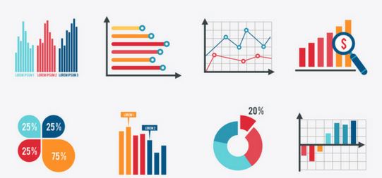
Tableau is used by data scientists to create vibrant and interactive reports that can be understood by almost anyone. Tableau provides a wide range of charts, graphs, and maps for analyzing business data. Tableau charts are used to visualize data and present it in a simple manner.The following Tableau Charts are available in Tableau Desktop:
Text Label: These charts are used to create crosstabs or Pivot data by keeping the dimensions in their respective columns and rows.
Heat Maps: It displays data in a tabular format with various colors.
Highlight Table: Highlight tables are used to display categorical information in color.
Symbol Maps: These maps are used to display geographical data in the form of bubbles.
Maps: Use maps to visualize geographical data.
Pie Chart: Used to visualize data that has two or more data variables/dimensions.Horizontal bars are commonly used to compare one dimension to another, such as charts comparing sales in different years.
Stacked Bars: Divides the horizontal further to add multiple dimensions. Side-by-Side Bars: These are used to compare independent variables by grouping them together.The circle view displays numerical data in circles rather than bars.Line charts are used to display the most recent trends, demand, or sales of products and services.
Dual Lines: A comparison of two or more products or trends.
Area Chart: A graphical representation of quantitative data.
Discrete Area Charts: These are used to display quantitative data in discrete areas.
Scatter Plot: A scatter plot is a graph that is used to determine the relationship between two variables. It is also employed in the development of regression models.
Histogram: A graphical representation of statistical data in a given range.
Gantt Chart: This diagram is used to calculate the duration of any activity or event.
Bullet chart: Used to compare and visualize various measurements and dimensions.
Bubble Chart: A chart that compares two variables by representing the data as bubbles. Higher sales in certain areas, for example, will be in larger bubbles than in other areas with lower sales.
Tableau Server Components:
A Tableau server contains the following components:
- Application Server
- VizQL Server
- Data Server
A) Application Server:
Authentication and authorization are handled by the application server. It is in charge of web and mobile interface administration and permissions. It ensures security by keeping track of each session id on Tableau Server. On the server, the administrator can set the session’s default timeout.
B) VizQL Server:
The VizQL server is used to convert data source queries into visualizations. When a client request is forwarded to the VizQL process, the query is sent directly to the data source and information in the form of images is retrieved. The user is shown this image or visualization. Tableau server creates a visualization cache to reduce load time. The cache can be shared by multiple users who have access to the visualization.
C) Database Server:
A data server manages and stores data from external data sources. It is a system for central data management. It manages metadata, secures data, stores data, and meets data connection and driver requirements. It saves data set details such as metadata, calculated fields, sets, groups, and parameters. The data source could extract data as well as connect to external data sources in real time.
Conclusion:
We hope you learned how to make bullet graphs in Tableau and use them for comparative analysis, performance metrics, and so on. It’s a simple way to combine multiple fields and view the data in various scenarios, such as highlighting performance against a benchmark, target vs actual values, performance against multiple benchmarks, qualitative and quantitative scales, and negative scales.