
- Microsoft Excel | A Complete Beginners Guide | REAL-TIME Examples
- What is Ms Excel Ribbon?
- Why You Should Do Microsoft Project Certification?
- Hidden Features in MS Excel 2013
- How to Become a Certified Microsoft Excel Professional
- Tips to Improve Your Basic Microsoft Excel Skills
- Microsoft Azure Certification Path

Tips to Improve Your Basic Microsoft Excel Skills
Last updated on 26th Sep 2020, Artciles, Blog, Microsoft
Over 30 years after its creation, Microsoft Excel remains the go-to software for the majority of people looking to do some quick data analysis.Sure, there is bigger, better, more complex software available for data analysis these days, but nothing has the broad-based appeal of Microsoft Excel.Numbers rarely lie, which is why making data-driven decisions is so important. Companies need skilled professionals who are able to turn those raw numbers into actionable insights. Of course, it would take thousands of hours to sift through it all manually and make connections with no tools to help, which is why learning how to use Excel and other data programs is the first step for those looking to enter this highly sought-after tech career. The right data analysis skills can turn raw information into sound business strategy.
11 key Excel skills and formulas you should know!
The aim of this project was to illuminate a pathway through the dense jungle of formulas and functions that makes Microsoft Excel the desktop software we both love and hate.We’ve picked out the top 11 Excel skills that will help you supercharge your data analysis abilities and prepare for a fantastic career in tech. We’ve even included a difficulty rating and how long each takes to master so you can pick the right ones for you. You can learn all of the below and so much more with the Ultimate Excel Bootcamp from Excel with Business. The Ultimate Excel Bootcamp is a 4-course bundle that includes Excel, Advanced Excel, PivotTables and Business Analysis. It’s ideal for beginners or more advanced Excel users.
Subscribe For Free Demo
Error: Contact form not found.
Excel Skill #1: PivotTables
Difficulty: 3 / 5
Mastery: 4 hours
At 4 hours to proficiency, PivotTables is one of the more time-intensive Excel skills to master, but it’s worth it. You can use them to sort, count, total, or average data stored in one large spreadsheet and display them in a new table, cut however you want.
Where to find it: Launch a PivotTable from the “Tables” section of the Insert tab once you have a table of data.
The versatility of PivotTables is what makes them so powerful. You simply drag and drop the relevant column data to create the table format you want.
A PivotTable will automatically group matching data, giving you quick summaries from a giant table. For example, if you had a table full of sales data and each line was a product and an amount, in a couple of clicks you could display all the data summed and group by product (something that would take much longer just using formulas or functions). (As a warning, make sure your data is clean first!)
If you are analyzing data with Excel, then PivotTables are THE most valuable thing you can learn.
Excel Skill #2: Flash Fill
Difficulty: 2 / 5
Mastery: 30 minutes
Excel developed a mind of its own in 2013, which is perfectly illustrated by this feature.
Say you have two columns of names and you need to construct email addresses from them all. With Flash Fill, you can just do it for the first row, and Excel will work out what you mean and do it for the rest (see image and video below). Pre-2013, this was possible but relied on a combination of functions (FIND, LEFT, &, etc). This way is much faster and WILL impress people.
Where to find it: If Flash Fill is turned on (File Options Advanced) it should just start working as you type. Or, get it going manually by clicking Data > Flash Fill, or Ctrl-E.
Excel Skill #3: Filters
Difficulty: 2 / 5
Mastery: 1 hour
Explore data in a table quickly. Filtering effectively hides data that is not of interest to you. Usually there’s a value, e.g. ‘Blue cars,’ that you’re looking for, and Filters will bring up those and hide the rest. But in more modern versions of Excel, you can now also filter on number values (e.g. is greater than, top 10%, etc), and cell color.
Filtering becomes more powerful when you need to filter more than one column in combination, e.g. both colors and vehicles, to find your blue car. Alt D F F is the shortcut (easier than it sounds—give it a go, pressing the keys in order rather than all together). Conditional Formatting and Sorting serve related purposes. Sorting involves re-arranging your spreadsheet, which is intrusive and may not be desirable. Conditional formatting brings visualization. Filtering is fast and effective. Choose well.
Where to find it: Apply filters by going to “Sort & Filter” in the Data tab.
Excel Skill #4: Conditional Formatting
Difficulty: 3 / 5
Mastery: 3 hours
Conditional Formatting changes the color of a cell and its contents given a certain condition. For example, you might want to highlight any negative numbers in red, or cells that contain a certain word. Conditional formatting makes this a breeze and makes colorful sense of data in a noisy world.
Conditional Formatting can be sophisticated. But even the simplest color changes can be hugely beneficial. Suppose you have volumes sold by sales staff each month. Just three clicks can reveal the top 10% of salespeople by performance and tee up an important business conversation.
Where to find it: On the Home tab in the “Styles” section.
Excel Skill #5: COUNTIF
Difficulty: 2 / 5
Mastery: 15 minutes
Counts cells with certain properties. For example, you want to find out how often a certain entry appears in a list. COUNTIF will look at the list and count it if it matches your chosen criteria. It’s an excellent function, very simple to learn, and one you’ll use over and over again when analyzing data.
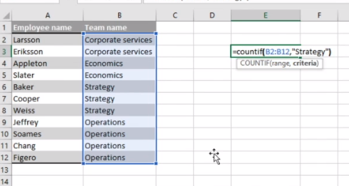
How it works: The syntax for COUNTIF is =COUNTIF(range [range of numbers you are looking at], criteria [criteria you are searching against]
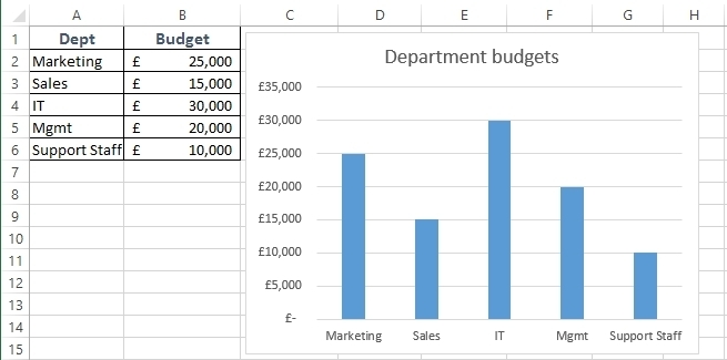
Excel Skill #6: Charts
Difficulty: 3 / 5
Mastery: 3 hours

Get On-Demand Microsoft Excel Courses to Become An Expert in Excel
- Instructor-led Sessions
- Real-life Case Studies
- Assignments
There are more than 20 chart types. Most people get by with Bar, Column, Pie, Line, and Scatter charts. With Bar, Column, Pie, and Line charts, you just need a single series of numbers to generate a chart. With a Scatter, you need two sets of corresponding data to compare (e.g. height vs. weight).
Charts are one of the most effective ways to display the data analysis you’ve conducted. Words and tables tell a story, but an image tells a thousand words; that’s what charts are doing for your data analysis.
Where to find it: Start exploring charts from the “Charts” section of the Insert tab.
Excel Skill #7: SUMIF
Difficulty: 3 / 5
Mastery: 15 minutes
Adds cells with certain properties. Like COUNTIF, these properties include: being a certain number or word (most useful), being above/below certain values, not equaling a value (<>), etc.Just like COUNTIF, SUMIF is incredibly useful when you want to pull out summary information from large datasets. In the example image below, we are adding together the sales that match the category Cola.
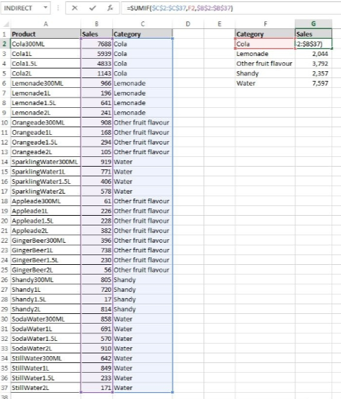
How it works: The syntax for SUMIF is: =SUMIF(range, [the range of cells to look at], criteria [the criteria determining which cells to add], sum range [the cells to add together]
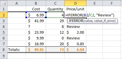
Excel Skill #8: IFERROR
Difficulty: 2 / 5
Mastery: 30 minutes
Errors (#VALUE!, #####, #DIV/0!, #REF!, etc) look ugly and can stop calculations from working (e.g. summing over a range of values with a single #DIV/0!). You can avoid it by using =IFERROR().
You can wrap any formula in IFERROR to remove those ugly error codes. For example: =IFERROR(VLOOKUP(B14,C6:D15,2,FALSE),””)
If this above VLOOKUP was returning an error, it would now return a blank cell. In Excel functions, quotation marks will return the information inside them, so if you put nothing between them (“”) then it returns an empty cell—genius.
Excel Skill #9: Slicers
Difficulty: 2 / 5
Mastery: 45 minutes
PivotTable slicers do the same thing as Filters—they enable you to show certain data and hide other data as required. But rather than dull drop-down menus, slicers offer nice big friendly buttons to make the whole user experience nicer and easier.
As well as fast filtering, slicers also tell you what the current filtering state is so you know what’s currently in and out of the PivotTable report.
Where to find it: Add a slicer to your PivotTable from the “Filters” section of the Insert tab.
Excel Skill #10: Power Pivots
Difficulty: 4 / 5
Mastery: 3 hours
This is a powerful feature which brings a lot more firepower to PivotTables (e.g. COUNTROWS) and more processing power to deal with much larger data sets. Power Pivot connects your PivotTables with external databases and can be refreshed on cue.
For example, say you had millions of rows of data—too much for Excel to handle—you could have these saved in an Access or SQL database. Using Power Pivot, you can pull this data into Excel and then run PivotTables and Charts straight off that data.
You can also create relationships between multiple tables, so if you have some data in one database and other data in another, no problem. Bring them together in Power Pivot and display your analysis using PivotTables and Charts.
Mostly for Excel experts and BI professionals. If you want to get serious about data analysis, then you need to spend some time getting to grips with Power Pivot.
Where to find it: Access it from the Data tab under “Data Tools”.
Excel Skill #11: Sparkline
Difficulty: 2 / 5
Mastery: 15 minutes
A Sparkline is a tiny chart in a worksheet cell that provides a visual representation of the data selected.
Sparklines are useful for showing trends in a series of values, such as seasonal increases or decreases, economic cycles, or to highlight maximum and minimum values. Sparklines can be displayed as lines or columns and can also represent any negative values. Position a Sparkline near its data for greatest impact.
Where to find it: Add your first Sparkline to your table from the “Sparklines” section of the Insert tab.
Conclusion
Developing Excel skills is a powerful way to start analyzing data like the professionals do. Whether you’re navigating toward a future career as a data analyst, you want a new skill to leverage at work, or you want to turn your household budget into an impressive well-oiled machine, learning how to analyze data in Excel with Excel formulas and tools will definitely ramp up the efficiency of your life.