
- Financial Performance – A Complete Tutorial
- How Six Sigma Principles Can Progress Your Productivity – Tutorial
- Google Analytics Pro Tutorial | Fast Track your Career
- Activity-Based Costing Tutorial | Know about Definition, Process, & Example
- Create a workbook in Excel Tutorial | Learn in 1 Day
- Excel ROUNDUP Formula Tutorial | Learn with Functions & Examples
- Business Analytics with Excel Tutorial | Learn In 1 Day
- SAP Tutorial – Free Guide Tutorial & REAL-TIME Examples
- IBM SPSS Statistics Tutorial: Getting Started with SPSS
- SAP Security Tutorial | Basics & Definition for Beginners
- SAP Simple Finance Tutorial | Ultimate Guide to Learn [Updated]
- SAP FIORI Tutorial | Learn in 1 Day FREE
- Introduction to Business Analytics with R Tutorial | Ultimate Guide to Learn
- Tableau Desktop Tutorial | Step by Step resource guide to learn Tableau
- Implementing SAP BW on SAP HANA | A Complete Guide
- SAP HANA Administration | Free Guide Tutorial & REAL-TIME Examples
- Tableau API Tutorial | Get Started with Tools, REST Basics
- SAP FICO ( Financial Accounting and Controlling ) Tutorial | Complete Guide
- Alteryx Tutorial | Step by Step Guide for Beginners
- Getting started with Amazon Athena Tutorial – Serverless Interactive | The Ultimate Guide
- Introduction to Looker Tutorial – A Complete Guide for Beginners
- Sitecore Tutorials | For Beginners Learn in 1 Day FREE |Ultimate Guide to Learn [UPDATED]
- Adobe Analytics Tutorial – The Ultimate Student Guide
- Splunk For Beginners – Learn Everything About Splunk with Free Online Tutorial
- An Overview of SAP HANA Tutorial: Learn in 1 Day FREE
- Statistical Package for the Social Sciences – SPSS Tutorial: The Ultimate Guide
- Splunk For Beginners – Learn Everything About Splunk with Free Online Tutorial
- Pentaho Tutorial – Best Resources To Learn in 1 Day | CHECK OUT
- Statistical Package for the Social Sciences – SPSS Tutorial: The Ultimate Guide
- An Overview of SAP HANA Tutorial: Learn in 1 Day FREE
- Spotfire Tutorial for Beginners | Quickstart – MUST- READ
- JasperReports Tutorial: Ultimate Guide to Learn [BEST & NEW]
- Charts and Tables – Qlikview Tutorial – Complete Guide
- TIBCO Business Works | Tutorial for Beginners – Learn From Home
- Cognos TM1 Tutorial : Learn Cognos from Experts
- Kibana
- Power BI Desktop Tutorial
- Tableau Tutorial
- SSAS Tutorial
- Creating Tableau Dashboards
- MDX Tutorial
- Tableau Cheat Sheet
- Analytics Tutorial
- Lean Maturity Matrix Tutorial
- MS Excel Tutorial
- Business Analysis Certification Levels & Their Requirements Tutorial
- Solution Assessment and Validation Tutorial
- Lean Six Sigma Tutorial
- Enterprise Analysis Tutorial
- Create Charts and Objects in Excel 2013 Tutorial
- Msbi Tutorial
- MicroStrategy Tutorial
- Advanced SAS Tutorial
- OBIEE Tutorial
- Tableau Server Tutorial
- OBIA Tutorial
- Business Analyst Tutorial
- Cognos Tutorial
- Qlik Sense Tutorial
- SAP-Bussiness Objects Tutorial
- SAS Tutorial
- PowerApps Tutorial
Charts and Tables – Qlikview Tutorial – Complete Guide
Last updated on 06th Aug 2022, Blog, Business Analytics, Tutorials
What is QlikView?
Purpose of Qlikview is to assemble data from varied data sources, the reports are found and created by using Qlikview features.
By this generated reports the relationship between data is derived automatically .It is a data discovery tool that facilitates the creation of dynamic apps for data analysis.
What are QlikView charts?
Charts are different from each other according to their way of representing numeric data or displaying information. Types of QlikView Charts:
- QlikView Block Chart
- QlikView Funnel Chart
- QlikView Radar Chart
- QlikView Grid Chart
- QlikView Line Chart
- QlikView Mekko Chart
- likView Scatter Chart
- QlikView Gauge Chart
QlikView Block Chart:
Block Chart in QlikView displays the arithmetic data values in blocks of varying areas.
The values can also be displayed on each block
Up to a few dimensions are often displayed, wherever every dimension is divided into sub-blocks.
An additional expression is used to calculate the color of each and every block.To develop a new block chart is to click the Create Chart in the toolbar.By right-clicking the Block Chart: Object Menu will be displayed. It may also be accessed from the item menu, once the block chart is the active object.
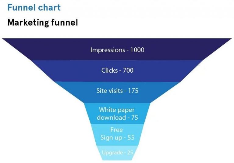
QlikView Funnel Chart:
Purpose of the Funnel Chart in QlikView is to display the Data flow or data in different stages.
To visualize the Wastage Cost or Production cost at every stage of the Production.
The funnel chart in QlikView can designed in two ways:
- Each segment in the funnel remains the same size
- The segments within the chart are proportionate to the data value in the field.
The green section is that the largest as a result of it corresponds to the full amount (239) of merchandise of the road Food, Beverages & Tobacco Like this, the section blue in color, representing Apparel & Accessories is the smallest of all as it corresponds to the lowest value 59.
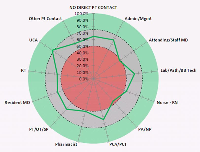
QlikView Radar Chart:
A radar chart in QlikView is a unique chart as it displays the numeric information like on a radar.
The x-axis wraps in the 360 degree round and so there is one y-axis for each x-axis value.
It can create a QlikView radar chart in the same way as to create other charts.
Radar charts need 2 dimensions and 1 measure.
The y-axis goes from the center to the perimeter and the x-axis is the perimeter of the chart.
Each value represents the distance from the center of the chart, and displays on axes initiated from the middle. The middle of the chart indicates the minimum value, and the edge the maximum value. A radar chart can display multiple series, each separately connected with their value.The information only goes around the chart once.
Adding values only when it increases the chart’s granularity.
QlikView Grid Chart:
A QlikView grid chart plots the dimension values on the axes and numerical data values .It is displayed as a single dot or symbol on the chart plane.It used the symbols of varying size sorted in a grid. The grid chart is included in the Visualization bundle.For product quantity, plotted against product line gives dots in place of every item’s quantity aligning in line with names of product lines written on the x-axis.
If there are 3 entries for health and beauty, there are 3 dots in that line for every value.
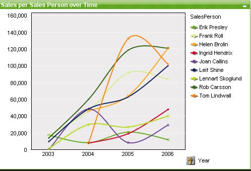
QlikView Line Chart:
A line chart in Qlikview represents data by connecting the numerical values with lines.This type of chart is used in finding trends or changes in business with time.This either has a line connecting all the value points or just symbols or both.
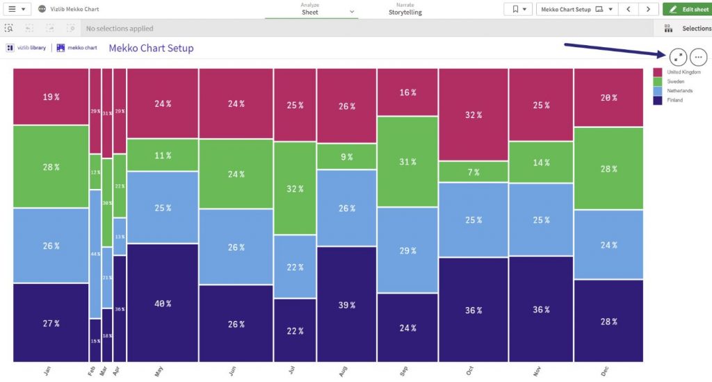
QlikView Mekko Chart:
Mekko charts in QlikView represent knowledge within the variety of bars of variable sizes or dimensions.It maintains great importance in business or market analysis.In this chart, every colored bar represents a product item bought from a store.The colors are assigned to every product line.Every bar gives the quantity bought for a specific product and the width of the bar also depends on the magnitude of the value.More the quantity bought, the wider the bar. This will also activate the same selections in other objects present on the sheet-like a list box or table box etc.
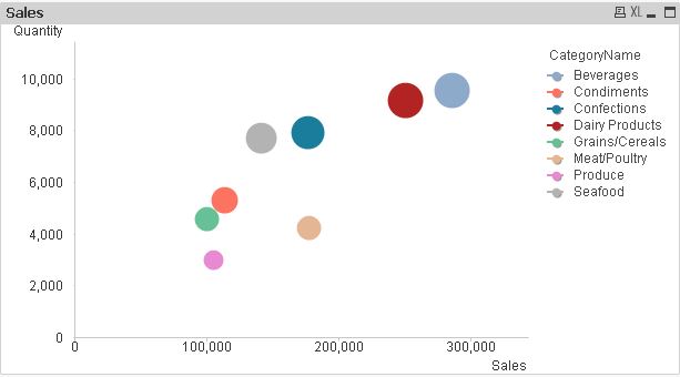
QlikView Scatter Chart:
Scatter chart in QlikView is similar to a grid chart.The only difference is that a scatter chart is used to plot and display data values of a dimension or field which has 2 values.
Plot a QlikView scatter chart between product cost and product quantity keeping the product line as the base dimension.Able to select different symbols in place, if simple dots and also change the size and color of it.
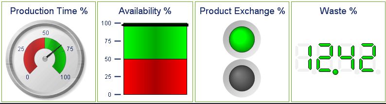
QlikView Gauge Chart:
Purpose of the gauge chart in QlikView is to display the information like in a meter gauge.Able to decide the high and low values by looking at the gauge needle. It displays only a single expression or data value and not the entire dimension.It can put in a variety of expressions for calculating percentages etc.
The needlepoint of the gauge changes as soon as make any selection in the table objects and display the information relating to that particular selected value.
The fastest way to create a new gauge chart is to select Quick Chart wizard from the Tools menu.
There are many styles of a gauge chart which select from the STYLE properties menu.
Conclusion:
It totally depends on correctly occurring data delivery.
The delivery of every message to its consumer correctly, on time without late.
The message delivery has to be done at a correct time and if not received within that particular time, alerts start to raise.