
- Financial Performance – A Complete Tutorial
- How Six Sigma Principles Can Progress Your Productivity – Tutorial
- Google Analytics Pro Tutorial | Fast Track your Career
- Activity-Based Costing Tutorial | Know about Definition, Process, & Example
- Create a workbook in Excel Tutorial | Learn in 1 Day
- Excel ROUNDUP Formula Tutorial | Learn with Functions & Examples
- Business Analytics with Excel Tutorial | Learn In 1 Day
- SAP Tutorial – Free Guide Tutorial & REAL-TIME Examples
- IBM SPSS Statistics Tutorial: Getting Started with SPSS
- SAP Security Tutorial | Basics & Definition for Beginners
- SAP Simple Finance Tutorial | Ultimate Guide to Learn [Updated]
- SAP FIORI Tutorial | Learn in 1 Day FREE
- Introduction to Business Analytics with R Tutorial | Ultimate Guide to Learn
- Tableau Desktop Tutorial | Step by Step resource guide to learn Tableau
- Implementing SAP BW on SAP HANA | A Complete Guide
- SAP HANA Administration | Free Guide Tutorial & REAL-TIME Examples
- Tableau API Tutorial | Get Started with Tools, REST Basics
- SAP FICO ( Financial Accounting and Controlling ) Tutorial | Complete Guide
- Alteryx Tutorial | Step by Step Guide for Beginners
- Getting started with Amazon Athena Tutorial – Serverless Interactive | The Ultimate Guide
- Introduction to Looker Tutorial – A Complete Guide for Beginners
- Sitecore Tutorials | For Beginners Learn in 1 Day FREE |Ultimate Guide to Learn [UPDATED]
- Adobe Analytics Tutorial – The Ultimate Student Guide
- Splunk For Beginners – Learn Everything About Splunk with Free Online Tutorial
- An Overview of SAP HANA Tutorial: Learn in 1 Day FREE
- Statistical Package for the Social Sciences – SPSS Tutorial: The Ultimate Guide
- Splunk For Beginners – Learn Everything About Splunk with Free Online Tutorial
- Pentaho Tutorial – Best Resources To Learn in 1 Day | CHECK OUT
- Statistical Package for the Social Sciences – SPSS Tutorial: The Ultimate Guide
- An Overview of SAP HANA Tutorial: Learn in 1 Day FREE
- Spotfire Tutorial for Beginners | Quickstart – MUST- READ
- JasperReports Tutorial: Ultimate Guide to Learn [BEST & NEW]
- Charts and Tables – Qlikview Tutorial – Complete Guide
- TIBCO Business Works | Tutorial for Beginners – Learn From Home
- Cognos TM1 Tutorial : Learn Cognos from Experts
- Kibana
- Power BI Desktop Tutorial
- Tableau Tutorial
- SSAS Tutorial
- Creating Tableau Dashboards
- MDX Tutorial
- Tableau Cheat Sheet
- Analytics Tutorial
- Lean Maturity Matrix Tutorial
- MS Excel Tutorial
- Business Analysis Certification Levels & Their Requirements Tutorial
- Solution Assessment and Validation Tutorial
- Lean Six Sigma Tutorial
- Enterprise Analysis Tutorial
- Create Charts and Objects in Excel 2013 Tutorial
- Msbi Tutorial
- MicroStrategy Tutorial
- Advanced SAS Tutorial
- OBIEE Tutorial
- Tableau Server Tutorial
- OBIA Tutorial
- Business Analyst Tutorial
- Cognos Tutorial
- Qlik Sense Tutorial
- SAP-Bussiness Objects Tutorial
- SAS Tutorial
- PowerApps Tutorial
Create Charts and Objects in Excel 2013 Tutorial
Last updated on 29th Sep 2020, Blog, Business Analytics, Tutorials
In Microsoft Excel, charts are used to make a graphical representation of any set of data. A chart is a visual representation of data, in which the data is represented by symbols such as bars in a bar chart or lines in a line chart.
Creating charts
Create a Chart in Excel 2003, 2000, and 98
Note: In older versions of Excel, click the chart type or subtype in the Chart Wizard to display a description of the chart.
- Step 1: Click Insert | Chart. The Chart Wizard appears.
- Step 2: Click the desired chart type in the left column, and click one of the chart sub-types in the right column. Click Next.
- Step 3: Excel assumes you wish to keep the series data in rows. You may click “Columns” to see how the chart changes. When finished, click Next.
- Step 4: Type a chart title. If you wish to add a title for the axes, do so. Then click Next.
- Step 5: Excel assumes you want the chart placed on the worksheet. If you would like the chart placed in a new sheet, click the radio button, type a sheet name, and click Finish.
To select an existing chart, click on its border, or click in an empty space inside the chart. When selecting a chart, be careful not to click on an element inside the chart or that element will be selected instead.
How to Delete a Chart
To delete a chart that has just been created, click the Excel Undo button. To delete an existing chart, select the chart by clicking on its edge, and press the Delete key, or right-click and select Cut.
How to Resize a Chart
To resize a chart, select the chart and drag any of the chart’s corners.
Subscribe For Free Demo
Error: Contact form not found.
How to Move a Chart

To move a chart to a different place on the worksheet, select the chart and drag it to the desired location.
To move a chart to a new or different spreadsheet in the same workbook, select the chart, right-click, and select Move Chart. Then choose the sheet or type in a new sheet name, and click OK.
With Excel 2013, you can create charts quickly by using the Quick Analysis Lens, which displays recommended charts to summarize your data. To display recommended charts, select the entire data range you want to chart, click the Quick Analysis button, and then click Charts to display the types of charts that Excel recommends.
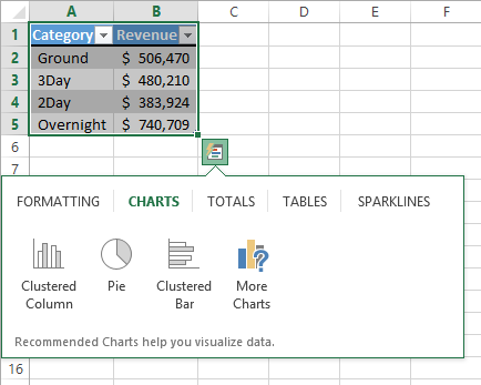
You can display a live preview of each recommended chart by pointing to the icon that represents that chart. Clicking the icon adds the chart to your worksheet.
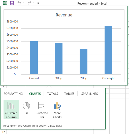
If the chart you want to create doesn’t appear in the Recommended Charts gallery, select the data that you want to summarize visually and then, on the Insert tab, in the Charts group, click the type of chart that you want to create to have Excel display the available chart subtypes. When you point to a subtype, Excel displays a live preview of what the chart will look like if you click that subtype.
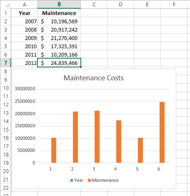
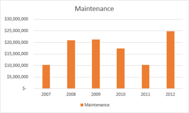
If Excel doesn’t plot your data the way that you want it to appear, you can change the axis on which Excel plots a data column. The most common reason for incorrect data plotting is that the column to be plotted on the horizontal axis contains numerical data instead of textual data. For example, if your data includes a Year column and a Maintenance column, instead of plotting maintenance data for each consecutive year along the horizontal axis, Excel plots both of those columns in the body of the chart and creates a sequential series to provide values for the horizontal axis.
You can change which data Excel applies to the vertical axis (also known as the y-axis) and the horizontal axis (also known as the x-axis). To make that change, select the chart and then, on the Design tab, in the Data group, click Select Data to open the Select Data Source dialog box.
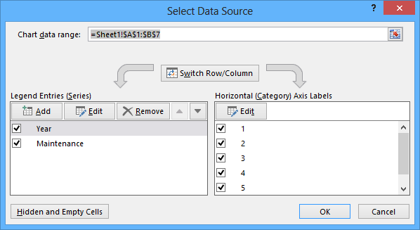
As shown in the preceding graphic, the Year column doesn’t belong in the Legend Entries (Series) pane, which corresponds to a column chart’s vertical axis. To remove a column from an axis, select the column’s name, and then click Remove. To add the column to the Horizontal (Category) Axis Labels pane, click that pane’s Edit button to display the Axis Labels dialog box, which you can use to select a range of cells on a worksheet to provide values for an axis.
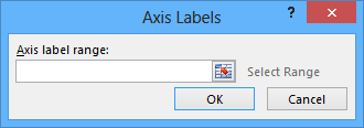
In the Axis Labels dialog box, click the Collapse Dialog button at the right edge of the Axis Label Range field, select the cells to provide the values for the horizontal axis (not including the column header, if any), click the Expand Dialog button, and then click OK. Click OK again to close the Select Data Source dialog box and revise your chart.
After you create your chart, you can change its size to reflect whether the chart should dominate its worksheet or take on a role as another informative element on the worksheet. For example, Gary Schare, the chief executive officer of Consolidated Messenger, could create a workbook that summarizes the performance of each of his company’s business units. In that case, he would display the chart and data for each business unit on the same worksheet, so he would want to make his charts small.
To resize a chart, select the chart, and then drag one of the handles on the chart’s edges. By using the handles in the middle of the edges, you can resize the chart in one direction. When you drag a handle on the left or right edge, the chart gets narrower or wider, whereas when you drag the handles on the chart’s top and bottom edges, the chart gets shorter or taller. You can drag a corner handle to change the chart’s height and width at the same time; and you can hold down the Shift key as you drag the corner handle to change the chart’s size without changing its proportions.
Just as you can control a chart’s size, you can also control its location. To move a chart within a worksheet, drag the chart to the desired location. If you want to move the chart to a new worksheet, click the chart and then, on the Design tool tab, in the Location group, click Move Chart to open the Move Chart dialog box.
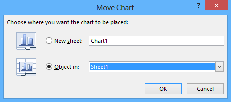
To move the chart to a new chart sheet, click New Sheet and enter the new sheet’s name in the accompanying field. Clicking New Sheet creates a chart sheet that contains only your chart. You can still resize the chart on that sheet, but when Excel creates the new chart sheet, the chart takes up the full sheet.
To move the chart to an existing worksheet, click Object In and then, in the Object In list, click the worksheet to which you want to move the chart.
In this exercise, you’ll create a chart, change how the chart plots your data, move your chart within a worksheet, and move your chart to its own chart sheet.
SET UP
You need the YearlyPackageVolume workbook located in the Chapter09 practice file folder to complete this exercise. Open the workbook, and then follow the steps.
- 1. On the Data worksheet, click any cell in the Excel table, and then press Ctrl+* to select the entire table.
- 2. In the lower-right corner of the Excel table, click the Quick Analysis button to display tools available in the Quick Analysis gallery.
- 3. Click the Charts tab to display the available chart types.
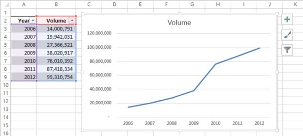
- 4. Click Line to create the recommended line chart.
- 5. Press Ctrl+Z to undo the last action and remove the chart from your worksheet.
- 6. On the Insert tab, in the Charts group, click Bar and then, in the 2D Bar group, click the first chart subtype, Clustered Bar. Excel creates the chart, with both the Year and Volume data series plotted in the body of the chart.
- 7. On the Design tab, in the Data group, click Select Data to open the Select Data Source dialog box.
- 8. In the Legend Entries (Series) area, click Year.
- 9. Click Remove to delete the Year series.
- 10. In the Horizontal (Category) Axis Labels area, click Edit to open the Axis Labels dialog box.
- 11. Select cells A3:A9, and then click OK. The Axis Labels dialog box closes, and the Select Data Source dialog box reappears with the years in the Horizontal (Category) Axis Labels area.
- 12. Click OK. Excel redraws your chart, using the years as the values for the horizontal axis.
- 13. Point to (don’t click) the body of the chart, and when the pointer changes to a four-headed arrow drag the chart up and to the left so that it covers the Excel table.
- 14. On the Design tab, in the Location group, click Move Chart to open the Move Chart dialog box.
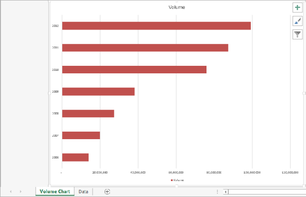
- 15. Click New sheet, enter Volume Chart in the sheet name box, and then click OK. Your chart appears on a chart sheet named Volume Chart.

Enroll in MicroSoft Excel Course to Build Your Skills & Advance Your Career
Weekday / Weekend BatchesSee Batch Details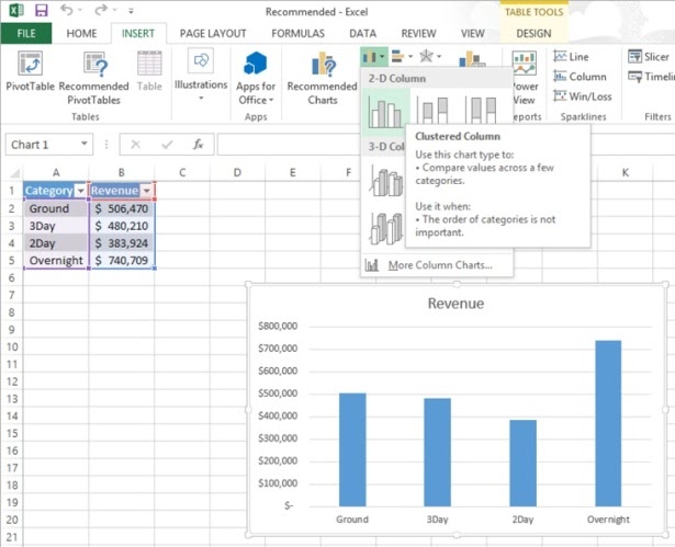
Excel Worksheet Objects
How to add objects, such as shapes and images, to a worksheet. If you copy data from a website, objects might also be copied. See how to list the objects on a sheet, or select and delete them.
Objects on a Worksheet
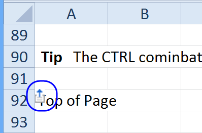
If you copy data from a website, and paste it into Excel, a few objects from the website might also be copied to your Excel sheet. In the screenshot below, there is a “Top of Page” icon — one of several that was copied along with the data.
This tutorial explains how to find the objects, select them, and quickly delete them.
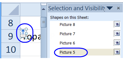
Show List of Objects on Worksheet
To see a list of the objects that are on a worksheet, you can open the Selection Pane:
- 1. On the Ribbon’s Home tab, click File & Select
- 2. Click Selection Pane
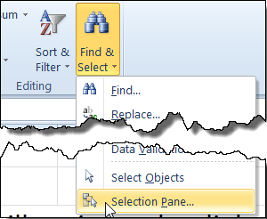
The Selection pane opens, and there is a list of all the objects on the worksheet. Click on an object name, and it will be selected on the worksheet.
Select All Objects
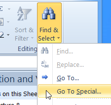
To quickly select all the objects on a worksheet, you can use the Go To Special command.
- 1. On the Ribbon’s Home tab, click Find & Select
- 2. Click Go To Special
- 3. In the Go To Special window, click on Objects, and click OK
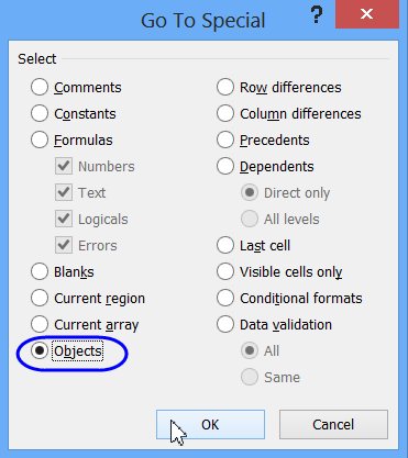
- 4. All the objects on the worksheet will be selected.
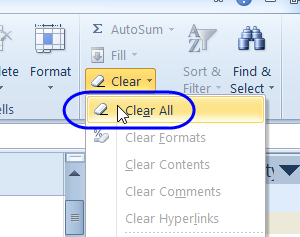
Delete Selected Objects
After you select all the objects on a worksheet, or select a single object, you can delete it.
- 1. On the Ribbon’s Home tab, click the Clear command
- 2. Click Clear All, to delete all of the selected objects.
Create Shapes for Macro Buttons
You can insert a shape, such as a rounded rectangle, on a worksheet, to use as button, to run a macro.
- 1. On the Ribbon’s Insert tab, click Shapes, then click the shape that you want to use as a button.
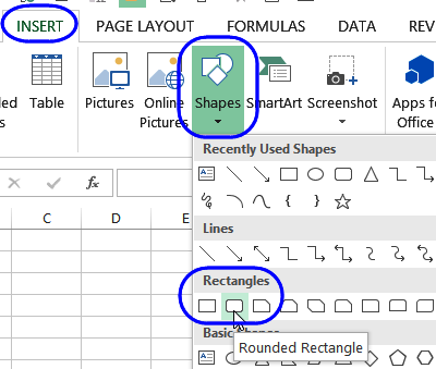
- 2. Then, click on the worksheet, where you want the top left corner of the button to appear.
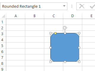
- 3. A shape will appear, in the default size. The shape is selected, and you can see its name in the NameBox — Rounded Rectangle 1, in this example.
Change the Shape Style
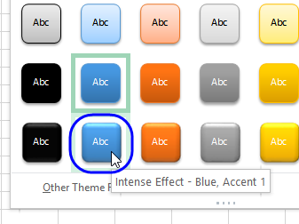
To make the shape look more like a button, you can add a Shape Style:
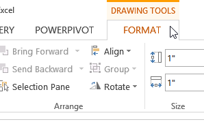
- Select the shape, and on the Ribbon, under Drawing Tools, click the Format tab
- NOTE: To select a shape after a macro has been assigned, right-click on the shape.
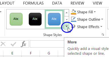
- In the Shape Styles section, click the More button, to open the gallery of styles.
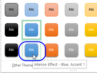
- Then, click on one of the Style options, such as Intense Effect. It has a slight shadow, which gives it a 3D effect.
Bevelled Theme Setting
If you plan to make several shapes in the workbook, and want them all to have a bevelled effect, you can change one of the Theme settings.
- On the Ribbon, click the Page Layout tab
- In the Themes group, click Effects
- Click the Office 2007-2010 option.
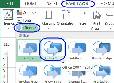
Now, when you look at the Style Gallery, the bottom row shapes will have a bevelled effect, like the styles had in Excel 2007 and 2010.
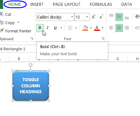
Add Text to Button
To make it clear what the button does, add some text. In this example, the button will run a macro that toggles the column headings, from numbers, to letters, or letters to numbers.
To add text:
- Select the button (NOTE: To select a shape after a macro has been assigned, right-click on the shape.)
- Type the text for the button
- Click the button’s border, to select the button again (This will take you out of the Text Editing mode, where you can see the cursor.)
- With the button selected, use the tools on the Ribbon’s Home tab, to make the text bold, larger size, centered, or any other formatting.
- Click on the worksheet, away from the button, to deselect it.
Make the Button Run a Macro
To make the macro run a macro that has been stored in the workbook:
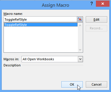
- 1. Right-click on the button, and click Assign Macro
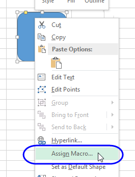
- 2. In the list of macros, click the one that you want the button to run, then click OK
NOTE: To select a shape after a macro has been assigned.
Conclusion
- You can use charts to summarize large sets of data in an easy-to-follow visual format.
- You’re not stuck with the chart you create; if you want to change it, you can.
- If you format many of your charts the same way, creating a chart template can save you a lot of work in the future.
- Adding chart labels and a legend makes your chart much easier to follow.
- When you format your data properly, you can create dual-axis charts, which are compact and easy to read.
- If your chart data represents a series of events over time (such as monthly or yearly sales), you can use trendline analysis to extrapolate future events based on the past data.
- With sparklines, you can summarize your data in a compact space, providing valuable context for values in your worksheets. With this, we come to the end of the Create Charts and Objects in Excel 2013 Tutorial.