
- Agile Sprint Planning | Everything You Need to Know
- What is Project Management Process ? : A Complete Guide
- What is Lean Management? : A Complete Guide
- What is ITIL ? Know about the Framework
- What is Six Sigma?| Know the tools used
- What is Kanban Training?|Know more about it
- Project Management Tools and Techniques : A Complete Guide
- What is Project Management? Everything You need to Know | Salary for the role
- Srum Org Certification? All you need to know about it
- MS Project Certification | All you need to know
- What is Project Manager? Know about the salary
- Six Sigma Certification Cost | Know all details about it
- Difference Between PMO and Project Manager? | Expert’s Top Picks
- What are Project Management Tools | Its Techniques | Everything You Need to Know
- What is Agile |Its Methodology and Types | How to Implement [ OverView ]
- What is a Product Roadmap? | How to Create one | A Complete Guide with Best Practices
- Scrum vs Kanban | Agile at Scale | New Agile BenchMark
- How to Effectively Manage Stakeholders | A Complete Guide For Beginners with Experts Top Picks
- What is Scaled Agile Framework (SAFe) | The Leading Framework For Business Agility | Everything You Need to Know
- How to Become a Project Manager | A Definitive Guide with Best Practices
- Time Management Tools to Help You Succeed as a Professional | Expert’s Top Picks
- Top 10 Tips for Agile Sprint Planning To Implement Efficient Marketing | Step-By-Step Process with REAL-TIME Examples
- What is ICP-ACC (ICAgile Certified Agile Coaching)? | A Definitive Guide with Best Practices [ OverView ]
- How To Run An Effective Agile Retrospective-Agile management | Everything You Need to Know
- What Skills Does One Acquire After The PMP Certification?
- A Definitive Guide: Most Effective and Proven Time Management Techniques [ OverView ]
- What Gaps I Filled After CSM Certification For my Scrum Project? [ OverView ]
- How to Create A Plan And Manage Your Projects Better?: Step-By-Step Process [ OverView ]
- What is User Story Mapping? : A Complete Guide with Best Practices
- What is Design Thinking ? : Benefits and Special Features | A Definitive Guide with Best Practices
- What is the Capability Maturity Model (CMM) [ For Freshers and Experience ]
- What is Sprint Planning ? | A Definitive Guide | Step-By-Step Process with REAL-TIME Examples
- What is Total Productive Maintenance (TPM) and How Does It Help in Equipment Effectiveness [ OverView ]
- What are Agile Metrics ? : A Complete Guide For Beginners [ OverView ]
- What is Agile Marketing and Why Do You Need It | Step-By-Step Process with REAL-TIME Examples
- Why is Retrospection Needed? : A Complete Guide For Beginners [ OverView ]
- Developing Project Schedule : Role of Float, Leads, and Lags [ OverView ]
- Project Life Cycle vs Product Life Cycle | Know Their Differences and Which Should You Learn?
- Projects in Business Environments | A Complete Guide For Beginners [ OverView ]
- What is Business Agility ? and Why is it Important ? Expert’s Top Picks
- The Most Important Benefits of Blended Learning | A Complete Guide For Beginners
- Can Business Analyst be a Project Manager? : Expert’s Top Picks
- Why A PMO Is Second In Line To A Project Manager ? | Expert’s Top Picks
- Devops vs Waterfall | A Definitive Guide and Which Should You Learn?
- Jira vs Trello | Know Their Differences and Which Should You Learn?
- Key Values and Principles Behind the Agile Manifesto | A Definitive Guide
- What are Scrum Ceremonies : The Ultimate Guide with Expert’s Top Picks
- Business Analyst vs Financial Analyst | Know Their Differences and Which Role is Better ?
- Learn Burndown Charts With Jira : Comprehensive Guide [ For Freshers and Experience ]
- What Is Scrum XP? : Step-By-Step Process with REAL-TIME Examples
- Phases of Project Management | Step-By-Step Process | Expert’s Top Picks
- Project Manager Salary in India – How much does a PM earn? [ Job & Future ]
- Why Do Scrum Masters Get Paid so Much? [For Freshers and Experience]
- What Best Describes a Scrum Team? All you need to know [ OverView ]
- JIRA vs TFS | Differences and Which Should You Learn?
- Anti-patterns of a Scrum Master : Step-By-Step Process
- SCM Tools and Frameworks | A Complete Guide with Best Practices
- Stages of Team Development | Everything You Need to Know
- Project Management Consultant : Job Description, Skills Required | Everything You Need to Know
- CSM vs PSM : Difference You Should Know
- Top Characteristics of a Project Manager : Expert’s Top Picks
- Roles And Responsibilities Of A Product Owner : Everything You Need to Know
- Common Project Risks and How to Tackle Them | Expert’s Top Picks
- Benefits of Having Shorter Sprints in Agile – Everything You Need to Know
- Group Discussion Tips | A Complete Guide with Best Practices
- PMP Certification Cost : All you need to know
- DMAIC Process and Methods | All you need to know [ OverView ]
- Agile Scrum Vs Kanban | Know the difference
- Deming vs Juran vs Crosby
- What is Project Scope Management and Why It’s Important?
- The Basic Principles of Project Management
- Top PMP Exam Questions and Answers for 2020
- Risk Management Strategies
- Roles and Responsibilities of A Scrum Master
- ROM Estimate Vs Definitive Estimate
- Guidelines for Creating and Maintaining a WBS Dictionary
- How to Become a Certified ScrumMaster?
- Top Professional Skills for 2020
- Fast Tracking Vs Crashing
- PMP Vs PRINCE2 Vs CAPM
- PMP Earned Value Management (EVM) And Formulas
- What is Certified Scrum Professional (CSM)?
- Top Leadership Theories Every Manager Should Know
- What is Deliverables in Project Management?
- How To Prepare For TOEFL
- History and evolution of the PMP Certification
- What Is Float In Microsoft Project?
- Rules to set you up for success in project
- What is Scrum Project Management?
- What Is Estimating Activity Duration in Project Management?
- What Are The PMP Terminologies Relating To Cost Knowledge Area?
- What is Project Scope Management processes?
- What Are The Types of Organization In PMP?
- Books to Beat the Scrum Master Certification
- Agile Coach Vs Agile Consultant
- What is the cost of quality in project management?
- Signs Your Career May Be Stagnation and Tips to Overcome Downturn
- Certified ScrumMaster (CSM) Certification
- Lean Six Sigma Black Belt Certification
- What is schedule Activity in project management?
- Why Do We Need a Project Charter?
- PMP Certification Exam Preparation Mind Map
- Why Quality Professionals Should Use Infographics In Project Management?
- Role of Earned Value Technique in Project Management
- What is Project Quality Management?
- Tools and Techniques to Estimate Project Cost
- What is a Project Charter And Project Scope in Project Management?
- Why Should You Conduct Project Status Meetings with Your Team?
- The 7 R’s of Change Management
- What Are The Categories and sources of risk in your project?
- What Is a Network Diagram in Project Management?
- What are The Types of Contracts In PMP?
- Residual Risk Vs Secondary Risk
- Impact of the stakeholders on the projects
- Effort Vs Duration Vs Elapsed Time
- Agile vs Scrum
- What Is Six Sigma Quality Assurance?
- How to Close a Project?
- What Qualifications Do You Need to be a Project Manager?
- Project Management Vs General Operations Management
- Enterprise Environmental Factors & Organizational Process Assets
- What is a project manager?
- Important Questions for PMP Certification Exam
- How is the PMP Exam changing, in 2015 & 2020?
- How To Renew Your PMP Certification?
- The Importance of Having Project Acceptance Criteria in Your Projects
- Tips for PMP Exam Preparation
- What is requirement traceability matrix RTM in Project Management?
- Poor Performance Appraisal? Here are the tips to turn any negative feedback into positive.
- How to build a successful Career in Agile and Scrum?
- Importance of Tuckman ladder model in HR management
- How To Apply For The PMP® Exam In Easy Steps
- How to Write a Six Sigma Problem Statement
- What is a lessons learned document in PMI?
- Perform Quality Assurance Vs Perform Quality Control
- How to Improve Quality Management Consistently?
- Interactive Vs Push Vs Pull Communication
- what is risk management?
- Key Appraisal Questions to Prepare For
- What are the MSP Certifications?
- What Is A Six Sigma Control Plan?
- How to Create a Project Plan in Excel?
- Agile Prioritization Techniques
- Tips to Help Millennials Climb the Corporate Ladder
- What is an Issue Log?
- Advantages of PMP over MBA
- Top Successful Project Estimation Techniques
- PMP Examination Preparation – ITTO’s
- Employee Training Rewards That Actually Improve Learning
- Lean principles
- What Does It Take to Become a Successful Agile Coach
- Projects VS Programs
- The Role of Six Sigma in Manufacturing
- The Top Formulas to Memorize Before Your PMP Exam
- Roadmap to CSM (Certified Scrum Master) Certification
- What are Some Qualities of a Good Manager and Good Leader?
- How to Handle Project Monitoring and Controlling Processes?
- Top Free Agile Tools For Any Project Manager
- Risk Assessment in Project Management
- The Concept of Zero Defects in Quality Management
- The Importance of Work Packages in Project Scope Management
- How to Get Project Management Experience for PMP Certification
- Different Ways to Calculate the Estimate at Completion (EAC)
- What Is a ScrumMaster?
- What is Risk Register?
- Agile Certifications
- Top-down Approach Vs Bottom-up Approach
- Leadership Vs Management
- What is Feasibility Study and Its Importance in Project Management?
- What Is a Project Management Plan?
- The Professional Advantages of the CAPM Certification
- PRINCE2 Vs PMP
- Rita Mulcahy’s PMP Prep and PMBOK® Guide
- What is Project Cycle Management?
- What is Project and Process Metrics?
- PMBOK® Sixth Edition is Here! What Project Managers Should Know?
- CAPM Certification
- Top Project Selection Methods for Project Managers
- Free Float Vs Total Float
- What is Critical Chain Project Management?
- How to Build a Career in Project Management?
- Scrum Master or Product Owner: What Suits You Better?
- Project Documentation and its Importance
- What is Performance Reporting in the Project Management?
- Top Highest Paying Tech Jobs in India

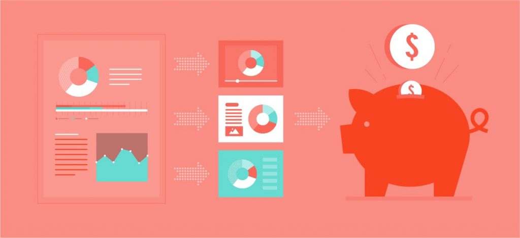
Why Quality Professionals Should Use Infographics In Project Management?
Last updated on 10th Oct 2020, Artciles, Blog, Project Management
WHAT IS AN INFOGRAPHIC?
An infographic is a visual-first medium. It’s designed to share information or tell a story in an organized way. And you know whether an infographic is truly an infographic if you can tell what it’s about before you read a word of text. That’s because infographics are designed to replace text-heavy content. We live in a world where people’s attention spans are dwindling. For example, audiences will read only 20% of a web page with 600 words or more. Because of this, if your content is a reading assignment, it’s by definition not an infographic.
People around the world still turn to infographics to learn and explore new ideas. Google searches for the word “infographic” have remained steady since 2015. And as new types of visual content have emerged, the infographic hasn’t fallen into the background. Instead, it’s been a big influence on next-generation marketing content. Moreover, it still plays a crucial role in campaigns and internal comms around the globe.
6 WAYS BUSINESSES USE INFOGRAPHICS
How are organizations today using infographics to drive marketing conversions and internal communications success stories? Let’s take a look at just a few of the many forms this type of visual content can take.
Subscribe For Free Demo
Error: Contact form not found.
1.THE LONG-SCROLL INFOGRAPHIC
Considered by many to be the “classic” infographic format, this style is still alive and well. It’s usually comprised of an image at least 1000 pixels wide, and can be as long as necessary to convey its message. The information is usually organized in an intentional way for 2 main reasons. First of all, organization helps viewers draw clear connections between the data points. And secondly, it facilitates telling a deliberate story.
While charts and graphs play an important role in most designs, not all infographics contain data visualization. They still include illustrations, icons, and other visual elements. But what you choose to include depends on what story you want to tell.
2. SOCIAL-MEDIA MICRO NARRATIVES
Social media is a crucial component of content marketing today. But the long-scroll infographic doesn’t always display well on all channels. That’s why we’ve seen the emergence of mini-infographics and social-media micro narratives.
These pieces of bite-sized content might include just a data visualization or two. Or they might simply comprise a single, engaging illustration. Whatever the contents, the goal is to drive engagement and sharing, since including visual content in a social-media post is shown to boost results. In one study, for instance, an organization saw 150% more retweets when it included images in its posts.
Mini-infographics and micro narratives can also be used to drive traffic back to a landing page where the full piece of visual content lives. And this is true whether it’s an infographic, an annual report, or a visual ebook.
3.ANNUAL AND FINANCIAL REPORTS
Organizations have seen just how powerful infographics and data visualizations can be when it comes to telling a story and bringing trends to light. And that’s why they’ve started using infographic-inspired design in their annual and financial reports.
These reports can take the form of a PDF, a printed booklet, or even an interactive landing page. (More on that later.) But the goal is always the same: they offer a way for viewers to cut through all the static and immediately see what’s most important. And that’s why they’ve become such a critical tool for today’s companies.
4.INFOGRAPHIC PRESENTATION & SLIDE DESIGNS
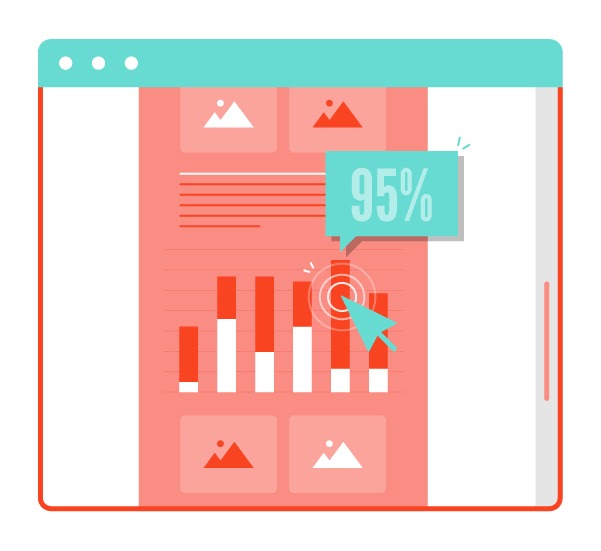
Whether you’re presenting in front of a boardroom or a conference hall, you want a slide deck that’s just as prepared as you are. Why? Because text-heavy slides distract viewers from what you’re saying. But data visualizations, illustrations, and other visual elements can actually elucidate what you’re saying. In fact, in comparison with text alone, visuals paired with text can boost comprehension by as much as 89%.
And since so many of us are visual learners, you’ll also be giving viewers images they’ll remember later — not to mention pictures they can live-tweet.
5.MOTION GRAPHICS & VIDEOS WITH ANIMATION OVERLAY
Motion graphics are in many ways the next generation of infographics. They can incorporate data visualization, illustration, icons, and more. But the added element of animation can, in some cases, make it even easier to tell a story. And given just how engaging video content is for audiences everywhere, motion graphics offer some impressive marketing opportunities for brands.
Likewise, live-action video with animation overlay in the form of graphs, charts, labels, and icons is growing increasingly popular. That’s because this type of animation helps viewers understand and interpret what they’re seeing. For example, these work great as explainer videos or educational videos on more complex topics.
6.INTERACTIVE INFOGRAPHICS, REPORTS, & EXPERIENCES
Interactive infographics are also part of the next generation of this kind of content. They incorporate elements like clickable maps and graphs, as well as embedded videos and animations. These all allow viewers to explore the content at their own pace, diving in as deeply as they like, or gaining a general overview of the topic. They can also be used to deliver annual report content, as in the case of this report for the 9/11 Memorial & Museum.
Interactive infographics and reports can live on their own landing page, like this interactive site for the Nuclear Threat Initiative. Alternately, they can be smaller elements or widgets embedded into a site. Whatever the case, they can be a powerful tool for engaging visitors — as a conversion rate of up to 70% attests.
9 INFOGRAPHIC DESIGN TIPS FROM A LEADING AGENCY
Since Killer Visual Strategies was founded, we’ve led the way in defining visual communication best practices for our industry. It’s not enough for your infographic to look beautiful. It also needs to keep your goals top-of-mind.
Want to know how to make an infographic that engages and converts? Follow these 9 essential rules.
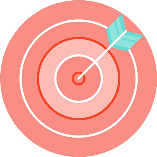
RULE 1: SET A CLEAR GOAL
Without a goal in mind, you can’t know what type of visual content to create — much less plan a direction for that content. Whether you’re setting goals for a particular marketing campaign or for your latest professional development effort, make sure those are clearly defined up front.

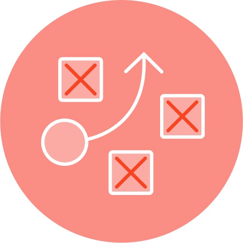
RULE 2: IDENTIFY YOUR TARGET AUDIENCE
Who do you want this campaign or piece of visual content to speak to? On what platforms does that audience spend the most time, and how do they prefer to communicate? What types of media do they prefer? And what tone and style will best reach them? All these questions must be answered before you can know how to make an infographic that will truly appeal to them.

RULE 3: PLAN FOR YOUR PLATFORM
If your audience spends most of their time on Instagram, you’ll want to ensure that the content you create will perform best on that platform. Would a series of mini-infographics for a post or an Instagram Story be the best fit? Or what about a short-form animated video? As you can see, the choices you make will be very different than if you were trying to reach them on Facebook or via email marketing. So make decisions about what platforms you’ll be optimizing for up front.

RULE 4: MINIMAL TEXT
An infographic isn’t really an infographic unless you can tell what it’s about without reading a word of text. That’s because it’s fundamentally a visual-first medium. Infographics arose because audiences were no longer willing to read through long blocks of text. So any design that makes them do that is not an infographic.

RULE 5: ACCURATE DATA VISUALIZATION
Visual communication is more than just graphic design. A trained visual communication designer doesn’t just create beautiful infographics and visual content. More than that, they understand the information and focus on conveying the message accurately and effectively. That holds true when it comes to data visualization, as well. You can’t build trust with your customers and employees if your charts and graphs don’t accurately reflect the data.

RULE 6: QUALITY OVER QUANTITY
Many marketers today feel pressured to produce as many pieces of visual content as possible, as fast as possible. When this happens, quality can suffer. They might try to use DIY tools or stock assets to speed the process along. But 1 well-designed infographic can do more for your company than 5 poorly designed assets. That’s because high-quality content reflects on your brand as high-quality, whereas bad design can actually make your brand look worse.

Take Your Career to the Next level with PMP Training
- Instructor-led Sessions
- Real-life Case Studies
- Assignments

RULE 7: TELL A STORY
It may not be clear that every infographic is telling a story. But the way in which you arrange the information you’re sharing is inevitably driven by some sort of narrative. This comes back to your goal. What do you want viewers to walk away with? Your design can guide them toward this goal. That’s why no well-made infographic is simply a random assortment of data around a topic. Instead, it’s organized with intention.

RULE 8: A CLEAR, COHESIVE DESIGN STYLE
Whether you’re following your brand guidelines or the art direction for a particular campaign, your infographic should have a clearly defined color palette, typography scheme, and design style. One way to get a bad design is to fail to do this: to mix, for instance, 3D illustrations with flat design, or to try to fit every color of the rainbow in a single design. These approaches overwhelm the viewer and make it hard to actually see and understand what’s being communicated.
RULE 9: STRONG PLANNING & PROJECT MANAGEMENT
All of the rules above require careful planning from the start of your project to the finish. That’s why having a great project management team on your side can make all the difference. Ask your infographic design agency who will be working on your project, and whether there will be a project manager who’s dedicated to ensuring your project’s success. A project manager will ensure that everyone keeps your goals top-of-mind.
HOW TO PROMOTE YOUR INFOGRAPHIC
You’ve put a lot of thought into planning and executing an infographic that will achieve your goals and reach your audience. But you also need to have the proper promotion strategy in place.
Luckily, by following the 9 rules above, you’ve already done a lot of that planning. For instance, key to promoting your infographic is making sure it’ll display well on every channel where you’re posting it. That can sometimes call for small redesigns to fit optimal channel dimensions. And this process becomes much easier when you’ve planned it from the start.
So now that your design is done, it’s time to create a unique version for each channel that you’re targeting. Firstly, you’ll need to customize with the right dimensions and video length, where applicable. Secondly, you’ll also want to make sure the tone and angle you take on each channel is suitable for that channel. For instance, viewers on Instagram might be interested in a more illustration-based or lighthearted take. But LinkedIn users are more interested in how your message relates to their business. Excerpt different sections of your infographic for different channels based on these factors.
And speaking of excerpting: as we’ve already said, a full-length infographic may not display well on all channels. So create social-media-optimized mini-infographics and micro narratives to drive traffic to a landing page featuring the full infographic. This has the added benefit of boosting site traffic, not just social-media engagement.
What’s more, creating social-media snippets like these gives your infographic a longer life. You can create several different posts over time, all from a single infographic.
Finally, though, think about visual content not just in the form of single assets, but in the context of full visual marketing campaigns. Most brands today need multiple pieces of content working together to truly drive success. Make sure these assets have a consistent appearance in order to drive brand recognition. At the same time, you’ll want to ensure that that style works for your campaign’s unique goals. So plan ahead for the full visual campaign, considering what style will work best across all mediums and channels. This will save you a great deal of time and money over the course of the campaign.
ENSURING A RETURN ON YOUR INVESTMENT
Reusing pieces of your infographic for social-media micro narratives isn’t the only way to boost ROI. You can also repurpose many of the elements in it for other visual content as part of a larger campaign.
A visual workbench is a set of assets you’ll want to use again and again. This is a group of icons that can represent your brand, your products and services, or anything your brand discusses often. Using an infographic as a workbench or jumping-off point for other content! Why? Because it’s a great way to save money and produce more content faster.
For instance, if you like an illustration used in your infographic, consider using it as the hero illustration in a motion graphic or short-form animated video (such as a GIF). Moreover, you can reuse icons and data visualizations in conference or boardroom presentations. And, you can repurpose charts for your annual report. In this way, even a single infographic design can be a repository of resources for future projects.
The infographic is alive and well. Further, it’s evolved into a slew of essential visual content types that we interact with on a daily basis. So whether you’re working with an infographic design agency or an internal team, ensure that they know how to make an infographic that’s not just beautiful, but optimized for your goals. Then use all the strategies outlined above to drive marketing and internal comms success.
8 Project Management Infographics
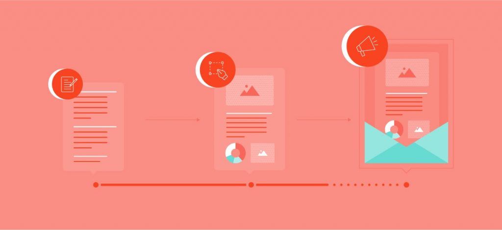
Casting your net in the realm of project management may be a bit overwhelming for some– especially when you’re not exactly sure where to start if you’re a newbie. Regardless, always learning more will put you ahead of the crowd and make the logistics of it all less difficult. Sometimes a great project management infographic is exactly what’s needed.
I’ve compiled 8 project management infographics from various sources on the net that can be helpful in your efforts to boosting your project management knowledge.
1.Outsourcing is becoming the new normal – what you need to know to minimize miscommunication :
This project management infographic provides a list of 20 topics that all Project Managers should address to avoid running into any obstacles. This list is broken down by people, process and technology.
2.Get back to the basics! Project management can be dated back to the build of the Giza Pyramids and the Colosseum :
It’s always good to know how far we’ve come and where we’ve come from. This infographic on the evolution of project management compares the 2000s to 2017 advancements of project management.
3. By 2020, 16 million new project management roles will be created :
If you’re working towards becoming a project manager, this infographic lists 8 key values that are essential for project managers overseeing a team. If you are already a project manager, do you possess these qualities?
4.10 project management best practices you should keep in your back pocket :
Get your project to run smoothly with these best practices. Simply being prepared with the knowledge of all methodologies may not be enough – being armed with these 10 common best practices from this project management infographic can make sure your project is successful all around.
5.Terms you should keep at your desk :
In project management, there are countless terms and acronyms that are always tossed around the office and on-site. To remain on top of your game and in the know, check out this infographic and 13 key project management terms you should know.
6.Get more done with less with these key project management processes :
Have you ever been given the responsibility of an important project, but minimal resources to get it done right? It can get very overwhelming. Here are 8 key processes to help you get over that hurdle and aim for project success.
7.Avoid project failure by avoiding these 10 project planning pitfalls :
Project management requires a lot of planning and if the planning phase isn’t done correctly then the whole project is bound to be doomed. Inaccurate estimation is one of the top causes of this.
8.Wastes of project management you need to know to avoid :
This may vary based on the nature of the project but for many, overproduction can be a problem which involves those who shouldn’t be. This contributes to unrealistic planning, an increase in idle time and inaccurate documentation to name a few.